We discussed writing Powerful Email Subject Lines for your email campaigns in the previous post.
With a killer subject line, you convinced your prospects to open your email.
But you know they will run away the next moment if your email copy isn’t great from the start. SiriusDecisions found that as much as 60-70% of content goes unread and unused. You don’t want that to happen to your email too, right?
Every marketer wants to come up with a great email copy. Every time.
So we set out in search of actionable tips on writing great email copy. We wanted something really insightful, something concrete, not mere armchair advice.
After going through a heap of material and posts, we zeroed down to the genuine experts. Experts who are not only influencers but also great at detailing. Experts who can look at the larger picture without missing the fineprint. Real experts, in short.
And what we found was amazing. Every advice, every tip, every suggestion was carefully thought through.
Let’s get into it right away!
1. Use the right size. And provide proof.
In a post in Econsultancy, Ornaith Killen highlights 8 things she thinks are vital to email copy . The first one is an eye-opener.
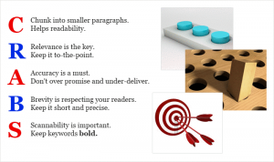
Killen tells us something critical: fewer people than you’d believe actually read your emails fully. So make sure your emails are scannable. That means the copy of your email should have
- Shorter paragraphs
- Bold fonts (wherever appropriate)
- Only one idea per paragraph
The other important thing she points out is using proof. In the flood of spam that people receive, it’s difficult, nearly impossible, to convince readers without proof. Killen strongly recommends you use facts and numbers so that the convincing is easier and quicker. Also make sure the benefits you are offering are clearly spelt out.
Here is Killen’s full post on writing effective email copy.
CRABS model, by Dave Chaffey, author of Total Email Marketing
2. Break it down. And make the CTA more visible.
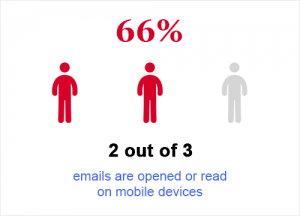
It’s something that’s right in front of us and that’s why we miss it. So MarketingLand has the numbers to remind us: on an average, 2 out of every 3 emails are opened or read on mobile devices. (The sub-title is witty; it reads:
“Two-thirds of email being read (or not) on smartphones and tablets.)”
McKenzie Gregory wrote a great post on how to create email copy that converts. In her list of tips, she reserves the best for the last.
She strongly recommends you break down the mail copy for – you guessed it – better reading.
Breaking down things like a list-post not only helps readers scan faster and but also grasp the CTA (Call To Action) faster.
Finally, it makes sense to keep the formatting of your emails friendly across various devices.
 3. Be conversational.
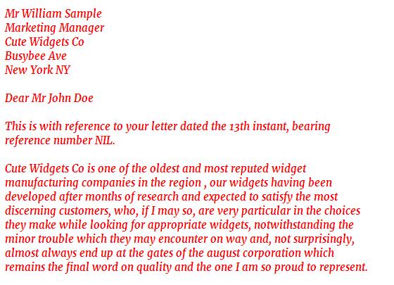
Emails are no longer those dry, business-letters that were stiff and went something like this:
Whoa! That was one long sentence, making no conversation at all. It was a monologue, one that kept talking about how great the company is. More importantly, notice how little or no mention has been made regarding the solution that the company can offer. The company is too full of itself, paying little or no attention to the prospect and his problems. The prospect is interested in solving his own problems, not in what heaps of praise you can load for your organization.
Aaron Beashel, in his insightful post on how to write email copy that sells, highlights the how important it is for the copy to be easy and conversational.
4. Your emails should be accessible.
As more and more businesses are ensuring accessibility of their products, emails cannot be ignored.
In her post on MailChimp, Emily explains the importance of accessibile emails: it is not only about being good but also about being business-savvy “…people with all abilities can access, perceive, and interact with … content. Good accessibility is really just good usability, which happens to be really good for business.”
If you’re not sure whether making your content accessible is really good business sense, Emily has evidence, like:
…people with disabilities bring roughly $225 billion to the consumer market in the United States.
She goes on to point out two important things that are central to accessibility and yet are likely to be overlooked.
Firstly, don’t forget the little alt-text. That short description that appears when the image is blocked or not visible, alt-text, becomes critical when you talk about accessibility issues.
Secondly, you may want to review the color combination in your design: how would it come across to a color-blind individual? For instance, are you aware most color-blind people have difficulty in perceiving red and green as separate colors?
Paying attention to such smaller details will go a long way in building a brand that adds not only value but is also perceived as sensitive. For instance, it’d be very unfortunate if your emails did not reach inboxes, simply the addresses were mistyped or incorrect. An email validation tool can clean your mailing list and free you from such worries.
Before we end, we’d surely like to share with you examples of some amazing email marketing campaigns. They took care of the things we mentioned here and also a lot more.
Lindsay Kolowich must have put in a lot of hard work for her post to come up with such great examples of awesome email copy. The examples themselves are wonderful and with the analysis Kolowich has come up with, the post is really full of value.
We’ll share more on this topic soon!
Meanwhile, what do you think? What are the best practices you use? What are some of the finest email marketing campaigns you can think of? Do share your ideas with us.
*********

 3. Be conversational.