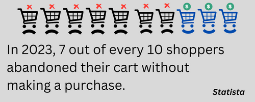
According to Statista, 69.99% of potential sales is lost due to shoppers abandoning their carts before completing a purchase. That’s a massive revenue leak.
Thankfully, businesses that implement effective cart recovery email strategy can recover a significant portion of these lost orders.
Abandoned cart emails are a proven way to re-engage shoppers and drive conversions. These targeted emails remind customers of unpurchased items and encourage them to complete their orders.
In this post, we’ll break down the best abandoned cart email examples of 2025. We’ll highlight what makes them effective and how you can apply these strategies to increase revenue.
But first, let’s explore why businesses send cart recovery emails and whether they truly work.
Why you should send cart abandonment emails
A well-crafted cart recovery email does more than remind – it converts like powerful sales emails. Here’s why they work:
- Lower customer acquisition costs: Retaining an existing customer, per a Harvard article, is five times cheaper than acquiring a new one.
- Higher profits: A 5% increase in retention can boost profits by 25% to 95%.
- Easier conversions: It’s much simpler to re-engage someone who already showed purchase intent than to convince a new visitor to buy.
Do abandoned cart emails work?
Absolutely. A decade-long study from Baymard Institute found that $260 billion in lost orders is recoverable.
These emails also have exceptional engagement. A study of emails sent to 9.3 million email addresses reported an average open rate of 41.8% – more than double the industry average of 20%.
If you’re not running cart recovery campaigns, you’re missing out on easy revenue. Let’s explore the best-performing abandoned cart email examples of 2025 and how you can use them to drive sales.
Best abandoned cart email examples of 2025
To make sure you get only the most recent examples, we’ve chosen only those emails that were sent in 2025. Enjoy the latest!
Before you read the detailed analysis, perhaps you’d like to check out this brief presentation we’ve prepared.
1. Animal Rescue Site
Even if you’re not a pet parent, the photo of a dog pushing a shopping cart is impossible to resist. The Animal Rescue Site (ASR) brilliantly combines the joy of shopping with the satisfaction of giving—every purchase helps feed and shelter rescued animals.
The subject line, “We Saved Your Cart”, is a clever play on words. ASR saves animals, and the near-homophones cart and cat make the message subtly witty.

What makes it stand out:
- Emotion-driven messaging: The email doesn’t push a sale; it highlights how each purchase contributes to a meaningful cause.
- Powerful social proof: A 4.8/5 rating from 20,000+ reviews and $75M raised build trust instantly. When over 20k people have spent money here, there’s no reason why social proof in your abandoned cart emails wouldn’t make an impact.
- Strategic placement of key messages: The mission statement, customer ratings, and donation impact are impossible to miss.
It turns a simple cart reminder into a feel-good moment, making customers want to complete their purchase – not just for themselves, but for the animals they’ll help.
2. Le Puzz
High shipping costs are one of the biggest reasons shoppers abandon carts. Le Puzz tackles this head-on with a well-crafted abandoned cart email that makes checkout feel effortless.
First, the discount code “Ok2Ship” is a CTA in itself. It mimics the natural way people confirm a purchase in a store – “Ok, pack it!”- turning it into “Ok, ship it!” for an online buy.
Second, the actual CTA tugs at emotions. We’ve all hesitated on a purchase over a small price gap. This email gently nudges shoppers to give in and treat themselves.
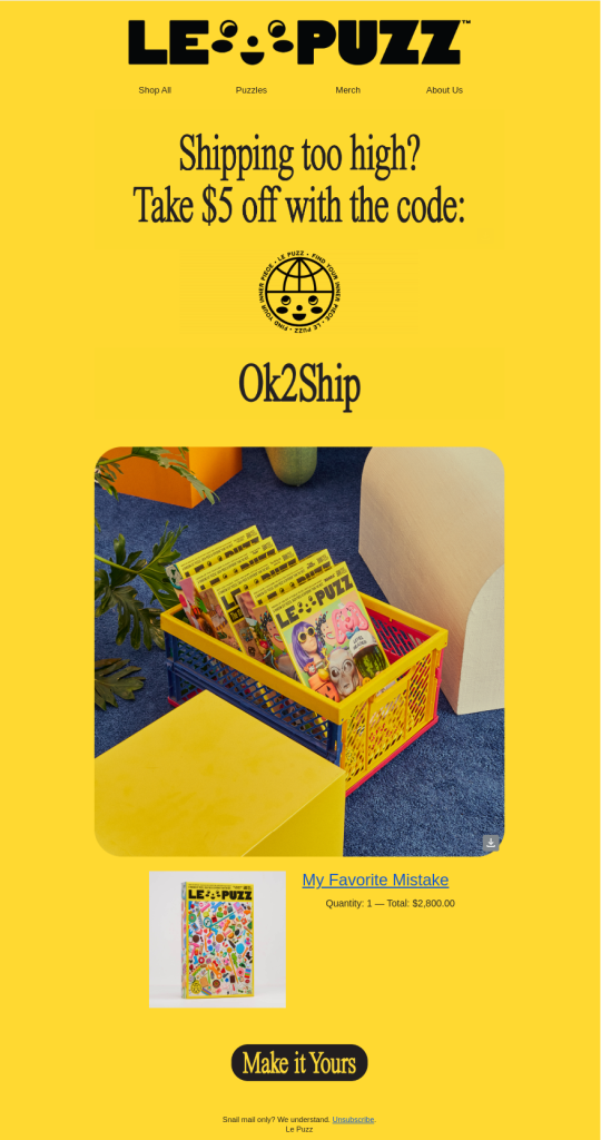
What makes it stand out:
- Website-like layout: The email design mirrors Le Puzz’s website, instantly bringing back the excitement of browsing and adding items to the cart.
- Lifestyle-driven product placement: Instead of a generic product shot, the puzzle sits in a homey crate, helping customers picture it in their own space.
- Subtle but effective emotional play: The combination of familiar design, relatable photography, and an encouraging CTA makes it hard to resist completing the purchase.
By recreating the shopping experience and making the product feel like it already belongs to the customer, Le Puzz turns hesitation into action.
When crafting abandoned cart emails, price and discounts aren’t always the biggest motivators. Sometimes, the key to winning customers back is selling the experience, not just the product.
3. oVertone
Great hair always turns heads. That’s why haircare is a booming ecommerce segment—one where abandoned cart emails can make a real impact.
oVertone takes a refreshingly simple approach to winning back hesitant shoppers. Instead of cluttering the email with text or discounts, they let the design do the talking. Clean white space, compact product images, and minimal distractions ensure high readability and a seamless browsing experience.
The email’s conversational tone makes it feel more like a friendly nudge than a sales pitch. And they have a great email opening line. It’s a playful twist on “Get out of my hair” that adds just the right amount of humor to draw the reader in.
At the bottom, oVertone preempts customer hesitation by answering two of the most common haircare questions. It’s a smooth way to build trust and encourage a quick decision.
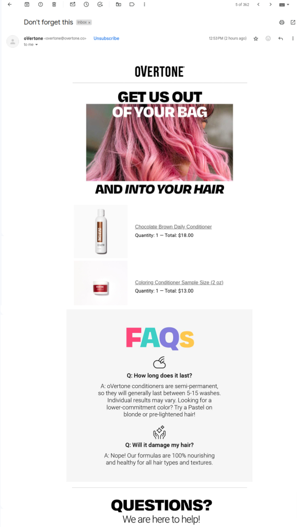
What makes it stand out
- A light, conversational subject line: It gives a rather personal rather than promotional look to the email, helping engagement.
- A clean, minimalist layout: It highlights products without overwhelming the reader.
- A witty, engaging opening line: This brings a smile on your face and turns a common phrase into a clever CTA.
By keeping it simple, fun, and focused, oVertone makes it easy for customers to return and complete their purchase.
4. Blackwolf
The more you can focus on other aspects of your products, the less you’ll need to talk about pricing. Blackwolf does this brilliantly. Their email highlights what truly matters to outdoor enthusiasts: the feeling of adventure.
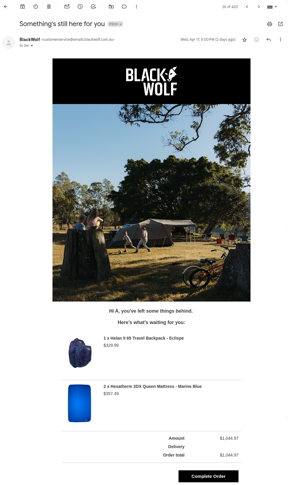
The image isn’t about the backpack itself—it’s about the experience it enables. No flashy colors, no overwhelming CTAs, just a compelling visual that evokes nostalgia, the thrill of exploration, and the urge to escape into nature.
What makes it stand out
Experience, and not the product, is on the forefront.
- Experience over product: Rather than showcasing a hi-res product image, Blackwolf lets an immersive photo do the selling.
- Emotional pull: The imagery sparks a desire for adventure, making the purchase feel like a gateway to that experience.
- Subtle but effective persuasion: By tapping into emotions, the email nudges customers toward completing their purchase—without ever feeling pushy.
Instead of saying, “Here’s a great backpack,” Blackwolf says, “Here’s the adventure you could have.” And that’s a far more powerful message.
That makes it a masterclass in using storytelling that knows how to increase conversion rates.
5. 23andme
Abandoned cart emails work best when they remind—not pressurize—customers to complete their purchase. And 23andMe nails this approach.
The subject line sets the tone: “Sometimes you need more time to decide.” No countdown timers, no urgency-driven FOMO—just a relaxed, supportive message that feels more like a check-in than a sales push.
The email copy seamlessly continues this approach. It reassures the recipient with “Don’t worry. Your cart is safe with us.”—offering a subtle form of urgency without being aggressive. By mentioning the cart is saved for 72 hours, 23andMe encourages action without feeling salesy.
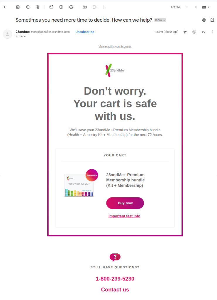
What makes it stand out
- Supportive, not pushy: The email feels like it’s from a helpful friend rather than a business chasing a sale.
- Cohesive messaging: The subject line and email copy align perfectly, reinforcing the brand’s trust-driven approach.
- Smart urgency: The 72-hour cart save adds a reason to act without using pressure tactics.
23andMe’s approach proves that a calm, reassuring tone can drive conversions just as effectively as high-pressure tactics—if not more.
6. BeardSurgeon
Standing out in the crowded world of men’s grooming isn’t easy. With so many options, it’s easy to hesitate before making a purchase. But what if the brand itself reached out to you—personally?
That’s exactly what happens with this email. Right after the friendly “Hey there,” you see something unexpected: a message from the co-founder himself. No automated, faceless reminder—this feels personal, direct, and worth reading.
And it doesn’t stop there. The email keeps things clean and compelling, showing only what truly matters: the product you left behind, a powerful CTA, and bold social proof in the form of 5-star reviews you can’t miss.
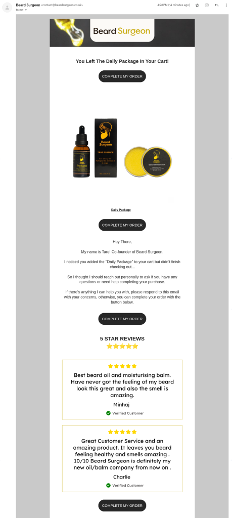
What makes it stand out
- Founder’s personal touch: The email feels like a direct message rather than a generic sales pitch, making the recipient feel valued.
- Strategic use of social proof: The larger font size for customer reviews ensures they grab attention, reinforcing trust before the reader even considers hesitating.
- Minimalist, high-impact design: No clutter. Just the essentials: your abandoned product, a clear CTA, and proof that others love it. This keeps the focus on taking action.

It strips away distractions and gets straight to the point: a personal connection, trust-building social proof, and a clear reason to complete the purchase.
7. Jessops
Buying photography gear online isn’t always straightforward. With so many technical specifications, shoppers often feel overwhelmed when making a decision. If the checkout process isn’t seamless, they might abandon their cart altogether.
Jessops tackles this challenge with a well-designed abandoned cart email. The black-and-white color scheme creates a clean, professional look that makes the process feel simpler.
The visual of two shopping cart boxes on a laptop keyboard instantly signals that this email is about completing an ecommerce purchase. And the headline “Forgotten Something?” is direct, effective, and impossible to ignore.
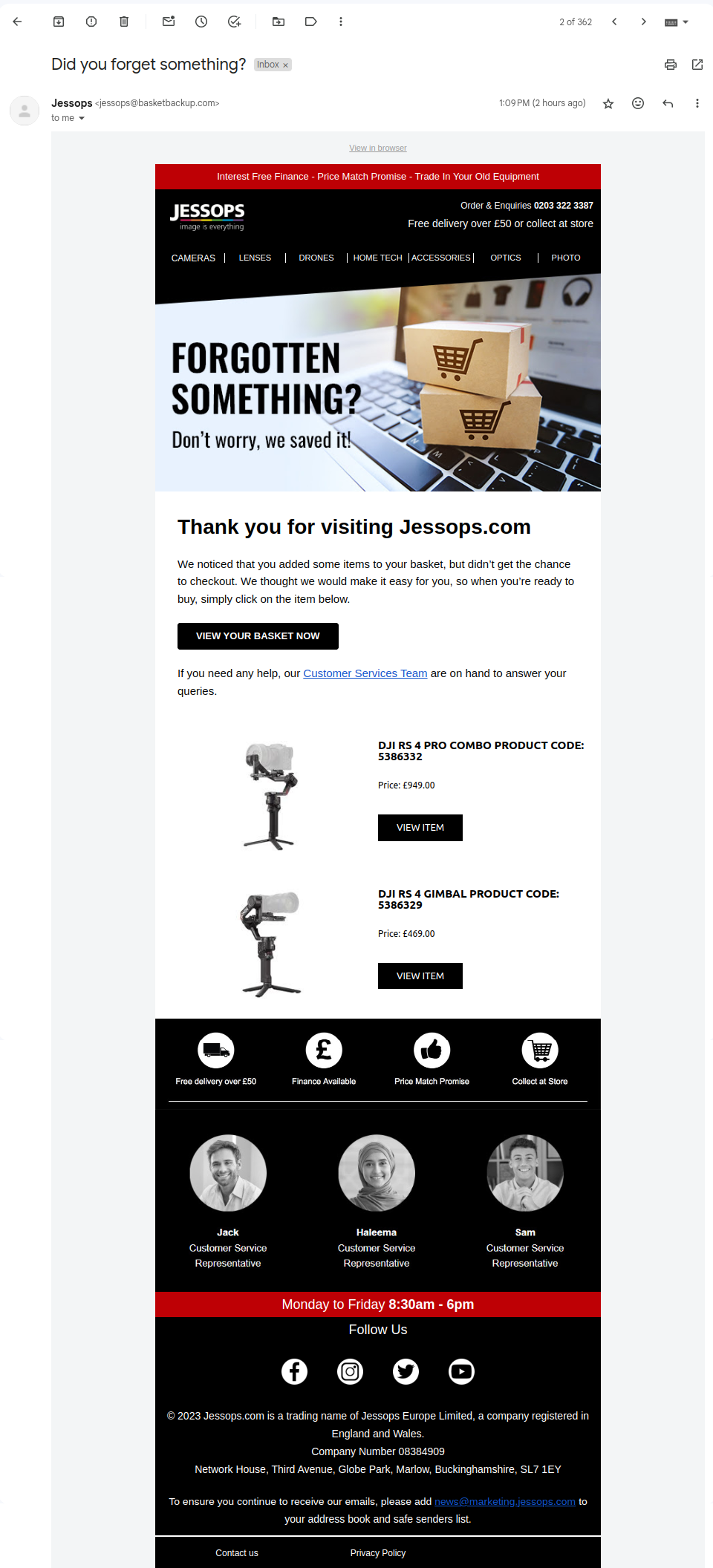
What makes it stand out
- Customer support front and center: Instead of pushing a hard sell, the email prioritizes assistance. Right below the CTA, there’s a direct link to customer support, acknowledging that photography gear is a considered purchase that may require extra guidance.
- Personal touch with real people: The email features names, roles, and photos of the support team, reassuring customers that help is available from real experts, not just an automated system.
- Addressing key purchase barriers: Shoppers hesitant to complete their order find immediate reassurance with four highlighted perks: free delivery, a price match promise, financing options, and in-store pickup. These details directly counter common objections and nudge the customer toward checkout.
Rather than pressuring customers, Jessops takes a trust-driven approach—offering support, reinforcing value, and making the checkout process feel effortless.
8. DollarShaveClub
When your business thrives on a subscription model, every abandoned cart is more than just a lost sale – it’s a missed opportunity for long-term revenue. You have to rely on email marketing for your ecommerce store, just the Dollar Shave Club (DSC) does. What makes them different is their ability to use their signature wit and sleek design to pull customers back in.
Known for their humorous branding and clever ad campaigns, DSC brings the same energy to their follow-up emails. Their approach? Minimal, effective, and visually scannable – ensuring that even the busiest shopper gets the message before moving on.
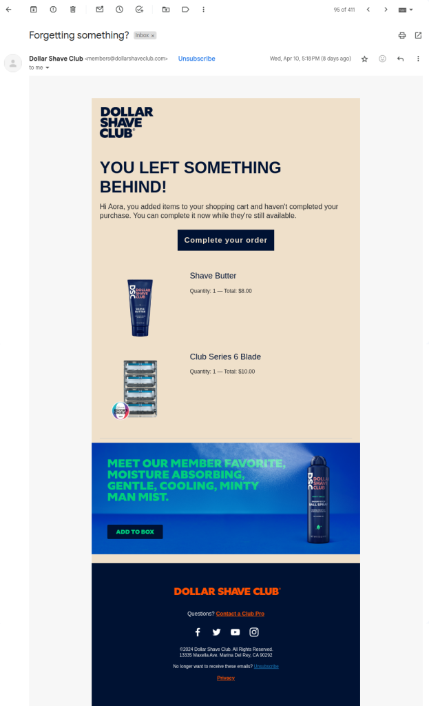
What makes it stand out
- Skimmable design: With plenty of white space, clear CTAs, and a concise layout, this email is built for speed-readers. Even if you skim, the key details pop out effortlessly.
- Minimal cognitive load: DSC limits product choices to just two (plus one promo item), keeping decisions simple and reducing overwhelm.
- Brand personality shines through: The email sticks to DSC’s witty, no-nonsense tone, reinforcing the brand’s identity while keeping things engaging.
This email isn’t just about recovering a lost sale—it’s about re-engaging a potential subscriber for the long haul, using clarity, simplicity, and a sharp brand voice to make the decision effortless.
9. Canadian Outdoor Equipment
The best sales strategy isn’t about pushing customers to buy—it’s about guiding them toward the right choice. When customers feel rushed or pressured into a purchase, they might regret it, leading to lost trust and lower lifetime value. But when they feel supported, they’re more likely to return.
That’s exactly the approach Canadian Outdoor Equipment takes in their abandoned cart email. Since outdoor gear isn’t an everyday purchase, they focus on helping rather than selling—ensuring customers have all the information they need to make the right decision.
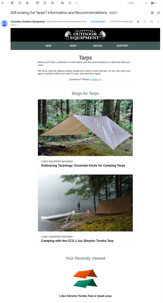
What makes it stand out
- Familiarity builds trust: Instead of a standard email layout, they designed their email like a website—complete with a menu. This subtle choice makes the experience feel seamless and familiar, reinforcing brand trust.
- No forced discounts – just useful information: Unlike many brands that rely on discounts to drive conversions, this email skips the price cuts. Instead, it highlights key product features—weather resistance, ease of setup, and safety—helping customers make an informed decision.
- Encourages exploration, not urgency: Instead of pushing a sale with time-sensitive pressure, the email invites customers to revisit their options, ensuring they find what truly meets their needs.
This isn’t just an abandoned cart email—it’s a customer experience enhancer. By prioritizing trust and helpfulness over aggressive sales tactics, Canadian Outdoor Equipment turns hesitant shoppers into confident buyers.
10. Prose
The personal grooming space ceased to be a ‘females only’ market long back. Males like to pamper themselves just as well, and the ever-widening range of grooming products for males has made the space crowded and highly competitive.
The best element of abandoned cart email when you’re in a very competitive market is perhaps how you personalize the email. You can understand the customer and the kind of products that suit them if they have a purchase history with you.
Here’s an email that doesn’t need previous engagement. Because personalization hasn’t been done using purchase history; it’s been done by the fact that the email was sent by the founder of the company.
Right below the ‘Hey There,’ you see the co-founder is writing to you. And that makes you sit up and take notice.
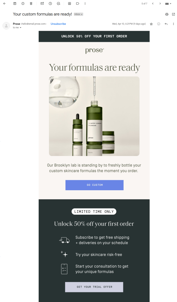
What makes it special
- Irresistible first hook: The email leads with a mega 50% discount, a proven tactic in high-converting abandoned cart emails.
- Personalization at its core: Instead of a generic “Your products are ready,” it says “Your formulas are ready”, reinforcing the tailor-made experience.
- Laser-focused messaging: The email keeps the copy short and purposeful, ensuring every word works to bring the shopper back.
It masterfully combines a strong incentive (50% off) with a personalized approach, making the recipient feel like the product is designed exclusively for them – leaving little reason to abandon the cart again.
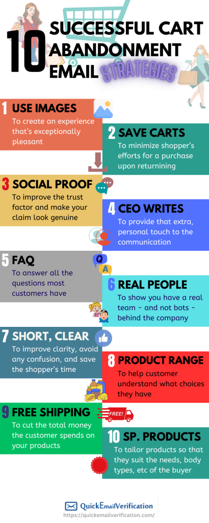
Cart abandonment email strategies: An infographic
Here’s an infographic that captures the successful strategies of cart abandonment, as discussed above.
Abandoned cart emails best practices
We just discussed the 10 best cart recovery emails. And you should feel free to create your own abandoned cart email template that uses a few best practices covered above. Add whatever tone you feel would yield better results.
For instance, some marketers have found better results by inserting a sense of urgency in their emails. Other marketers have found success with their free shipping offer. Still others found personalized subject lines worked best for them.
You may leverage your email marketing KPIs in order to understand your customers’ preferences. Hence you’ll want to tweak your own cart abandonment campaign one thing at a time to see what works.
Here’s a quick summary of the above examples:
| Business | Products | Target pain point | Key solution |
| Blackwolf | Outdoor gear | Product difficult to differentiate | Use images to create and convey beautiful experiences |
| 23andme | DNA Testing | Cart deleted | Cart is preserved |
| Animal Rescue Site | Raise funds for animal shelters by selling apparel | Customers unsure of product quality | Providing social proof through credentials |
| BeardSurgeon | Personal grooming | Impersonal messaging | Co-founder sends emails |
| oVertone | Hair care | Questions about product | Key FAQs answered |
| Jessops | Photography | Technical specs of product | Photo and names of service teams displayed to allay fears |
| Dollar Shave Club | Personal grooming | Lengthy emails confuse readers | Email is short and clear, with lots of white space |
| Canadian Outdoor Equipment | Camping gear | Limited range | Wide range of products displayed |
| Le Puzz | Puzzles | Shipping costs | Free shipping |
| Prose | Personalized hair and skincare | Customers have to purhcase without considering their unique needs | Product combinations offered are based on the buyer’s preferences, body type,and more |
A small word of caution: it’s important to not treat any abandoned cart email example in isolation. Just improving your emails may or may not work.
What you can do next
Any successful strategy that targets abandoned carts must also explore and find where the system is broken. Is your checkout page poorly designed? Are you throwing up unexpected shipping costs at the last moment? Is a clear call to action missing? Or are there some issues with your ecommerce website itself?
Once you plug all the holes, recovering lost sales will be a great deal easier.
So what are your favorite examples and strategies?