A detailed email campaign pre-send checklist is a must for marketers, because once you hit ‘Send ‘ it’s not possible to undo sending the email. You commit any of the small email marketing mistakes and all the hard work your team has put into the campaign could go down the drain.
That’s exactly why sending marketing email can stress out your marketing teams (yes, there’s something called email anxiety too). In order to beat that anxiety, you want to have a solid process if you want to be sure you’ve taken care of everything before you hit Send.
Which is why it makes sense to run your email past a comprehensive checklist before you send it out to your subscribers.
So we put together an exhaustive email QA checklist. Every time you feel your email is ready to be sent, stop for a moment and verify each of the 21 items on this list, till you’re sure you’re using a professional email format.
We’ve classified these items under three heads: High-level items, Mid-level items and Operational-level items.
As the names suggest, High-level items have a long-term impact, Operational-level items have a short-term impact; the impact of Mid-level items lies somewhere in between.
Want to quickly download the checklist? Click here to download.
Prefer a bigger version instead?
Read on!
Email Pre-send checklist: High-level items
1. Objective
Ask: Are we clear about what we want out of the email?
Why this matters: Being clear about your objective ensures you include the right elements inside the email: CTAs, copy, mages, links… You don’t want, for instance, your email copy to focus more on your ebook while you’re trying to sign them up for a webinar. Or, an email that’s trying to attract more people for a skiing holiday can fail miserably if it doesn’t have any pics.
2. Strategy
Ask: Does the message and timing fit into our overall strategy?
Why this matters: Your strategy makes sure you’re headed the right way. As an example, if you’re trying to sell a luxury item, you don’t want to ruin your efforts by harping on how cost-effective it is. If you’re a SaaS business, for instance, make sure you’re pitching to the people who are keen to solve the problem you have a solution to.
3. Platform
Ask: Is the platform we’re using in lines with our policy?
Why this matters: A good ESP (Email Service Provider) that you use to send emails can take a lot off your back. They can help you with a lot of tasks, like scheduling emails, segregating unsubscribe requests and updating your email lists and so on. The right ESP partner keeps you efficient, agile, and effective so look at them as a strategic partner.
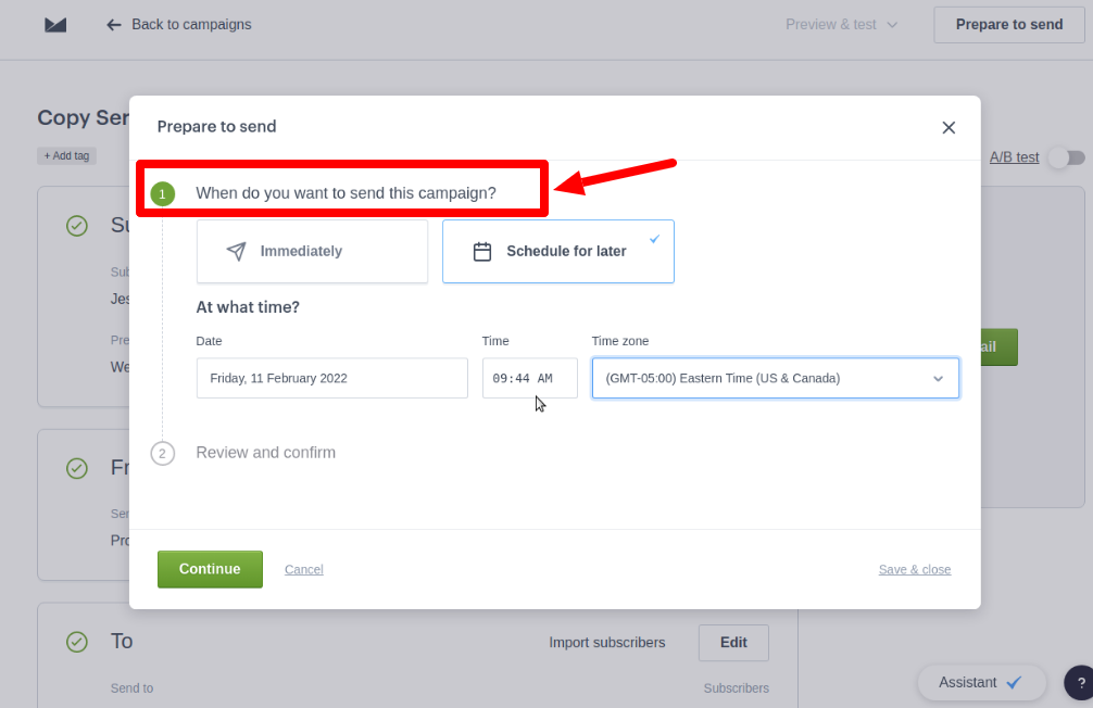
As an example, the ESP CampaignMonitor (image above) lets you schedule your emails, just like all major ESPs. It’s quite simple, but it does give you a lot of control over your email.
4. Branding
Ask: Does the email contain the right brand indicators, including logos and fonts?
Why this matters: This step is an important one in your email QA checklist before you hit Send. Brand signals are key to engaging your audience, building trust, and encouraging action. The moment your prospects see these elements in your email, they instantly trust your email without putting any undue cognitive load on them.
Look at the image below, where we’ve juxtaposed two different emails from MarketingProfs.
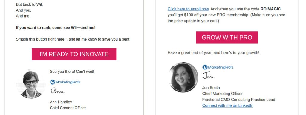
There’s no way you missed how identical they are, in terms of:
- Font typeface
- Color and all caps style of the CTA button
- Positioning of the logo
- Handwriting fonts used in sender’s names
- Practice of mentioning the role of the sender
They build brand trust by being consistent with design and colors. The moment you see these elements, you recognize it’s MarketingProfs.
5. Compliance
Ask: Is our email message compliant with the email marketing regulations? Are we following best practices?
Why this matters: Unlike what a novice may tell you, email marketing is not free in the traditional sense of the word. Sure, it’s low-cost, but it can prove expensive if you aren’t careful of the compliance requirements you need to meet. By using a checklist, email marketing can bring you the ROI you want.
Here’s an elaborate example from Costco. Their email doesn’t just contain the basics (like an Unsubscribe link, for instance), there’s a lot more. The footer contains pricing and availability disclaimers, links to their privacy policy, terms, and many more things.
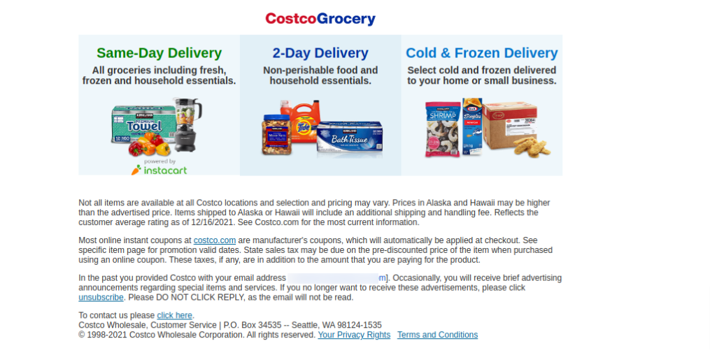
Of course, not all businesses may need to have such an extensive cover for compliance. All the same, this email nevertheless is a great reference.
6. Authentications
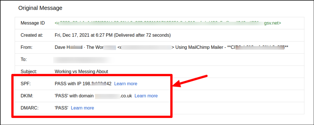
Ask: Are all authentications like SPF and DKIM in place?
Why this matters: Unlike most other items on this list, authentication is mostly a one-time activity (unless you change a lot of technical stuff at your end). Absence of appropriate authentication can trigger the spam filters of servers. Hence, by using email authentication you will guide the recipient mailbox servers to trust your incoming emails.
Establishing your authentication is not difficult, and considering its importance, you should place these authentications at top priority. As part of your email QA, when you check your authentication you’ll get to see something like the following.
7. Clean list
Ask: Did we verify the validity of all the email addresses on the list?
Why this matters: You cannot overemphasize the importance of a clean, verified email list. Email verification ensures your list is free from poor quality, undeliverable, or invalid email addresses.
By keeping your email list free of risky email addresses, you not only ensure almost zero hard bounce (an email returned undelivered because the recipient address is invalid) but also maintain your sender reputation, achieve better marketing ROI, and get your more accurate analytics.
Take a look.

The screenshot above shows you the verification summary of QuickEmailVerification. As you can see, it has neatly classified the email address under various heads.
This helps you with the next step. For instance, you can send a re-engagement email to unknown addresses. If the recipient responds positively, you can keep them on your list, else you can move the address to the suppression list.
8. Call to Action (CTA)
Ask: Will our recipient understand what action we want them to take?
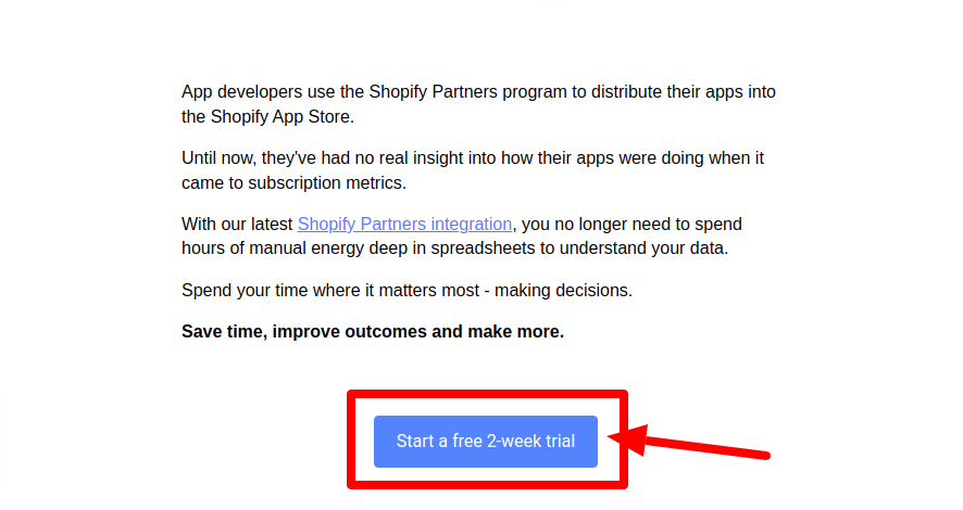
Why this matters: One of the most important items on your email QA checklist is your CTA. Does your CTA stand out in the text and design of the email? Will the recipient clearly understand what are the benefits of taking the action? Does the action sound desirable?
The following image is a good example of a simple and extremely clear CTA. Along with a professional email format, the strong, clear CTA attracts attention and prompts action because of the clear benefit (‘free 2-week trial’).
Email Pre-send checklist: Mid-level items
9. Requirements
Ask: Does our email have the requisite elements to avoid spam filters?
Why this matters: Apart from compliance requirements, your emails should meet certain best practices. By observing these practices, you can ensure that spam filters don’t suspect your email as spam. Most of these practices are relatively simple and easy to follow, but you’ve got to follow them.
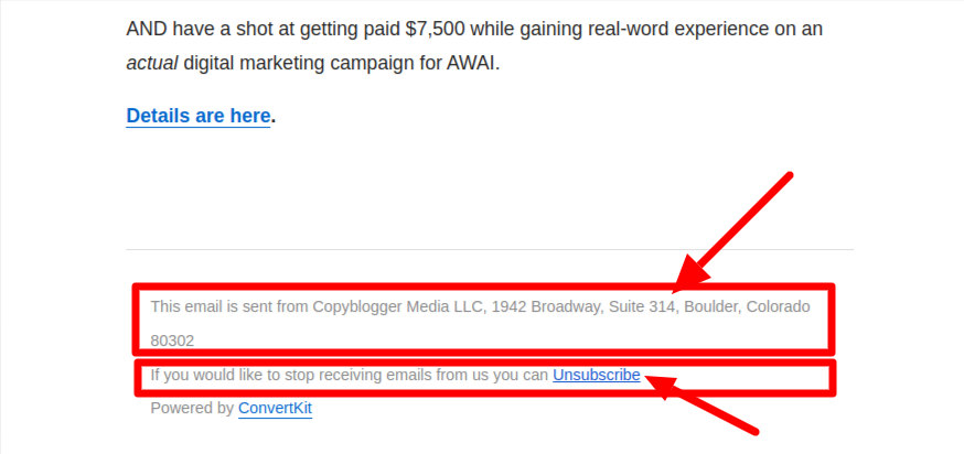
For example, your outgoing email should contain the full postal address. There should be an Unsubscribe link placed in a way that’s readable.
The following image is a good illustration of what requirements you should keep in mind.
With an email checklist, template of your regular marketing messages can turn into powerful emails that really work.
10. Subject line
Ask: Have we optimised the subject line? Did I carry out A/B testing?
Why this matters: It’s difficult to overemphasize the importance of subject lines in the context of the performance of your email. OptinMonster cites a study which found that about 47% of emails are opened based on the subject line alone. That’s nearly half of the total, right?
Here are four subject lines that are good:
This one makes a clear promise:
![]()
The one below is paradoxical, but clearly hints at a solution:
![]()
This one takes a simple, problem-resolution apprroach:
![]()
And this one has a tint of humour:
![]()
Caution: While each of the above subject lines may be effective, there’s no one type that suits everyone. There’s a wide variety of subject lines that marketers use: humorous, emotional, data-backed, quirky, suspenseful, plain…
Ideally, start with multiple subject line options. Then check them against your brand voice, test them with your audience, and see which one works best.
11. Accessibility
Ask: Can our email be read with the help of assistive technologies like a screen reader?
Why this matters: The American Foundation for the Blind (AFB) reports that the US alone has over 32 million people (about 13% of the entire American population) who have trouble with their vision. (This includes those people who are completely blind.)
Do you realize that’s about 1 in every 7 persons?
Such data confirms that without making provisions for accessibility, you might ignoring a sizeable chunk of your audience. You’re probably stepping on toes by not respecting the legal rights of the visually impaired. And finally, you’re denying your visitors access to your email for no fault of theirs.
12. Convenience
Ask: Is the desired action easy to take?
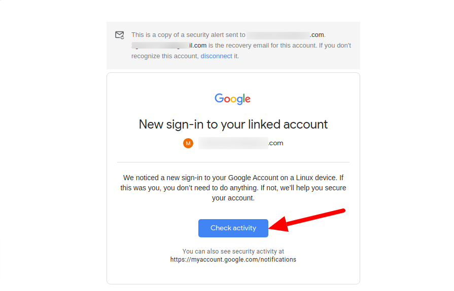
Why this matters: It’s important to make sure your CTA is easy to spot, clearly worded, and attractive enough. Even if you’re not selling something, you owe clarity to your reader.
Look at the screenshot of Google’s email. Even if I don’t read anything else, the CTA button gives me some sense of what I’ll get if I click the button.
This is not to say you shouldn’t use suspense or humour, but make sure you don’t make things any more difficult for your email recipient.
13. Value
Ask: What value will this email add to the recipient?
Why this matters: There’s tons of things clamouring for your reader’s attention, so why’d they care for your teeny weeny email? Your email needs to create something strongly desirable, something valuable for the reader, or else they won’t take any action.
Look at the following. Henneke from Enchanting Marketing makes a big promise: Biggest lessons of the year (2021, in this case).
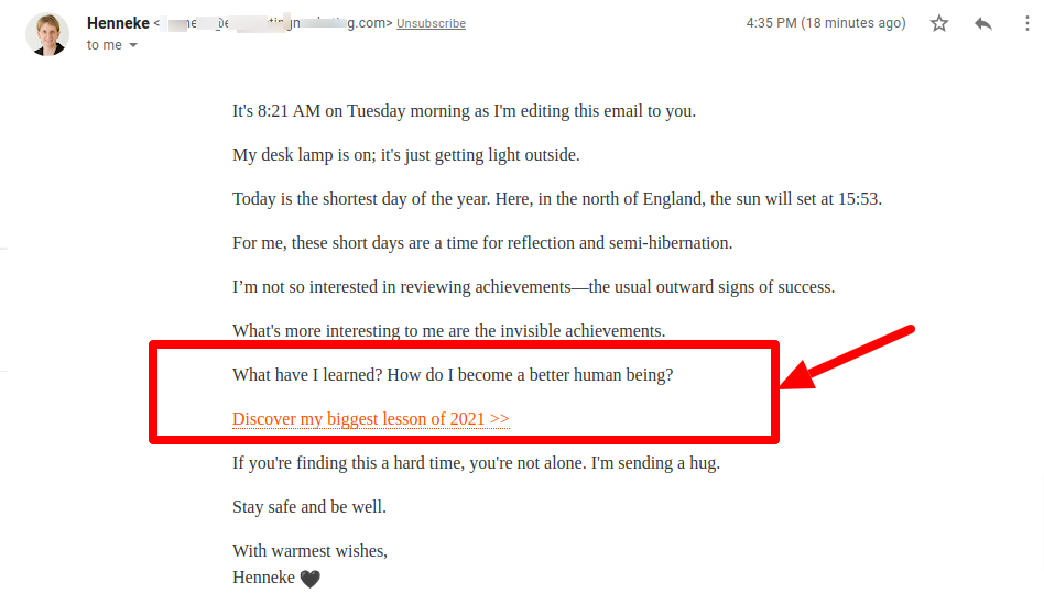
For sure, the email copy is amazing. But more importantly, Henneke is willing to share the lessons she has learnt. And that’s truly valuable.
14. Preview text
Ask: Is the preview text interesting enough for people to open the email?
Why it matters: The first thing that your readers read after the subject line of your email isn’t your copy or CTA button, it’s the preview text (also known as the preheader text). Just because the preview text is the younger sibling of the subject line, don’t make it wear hand-me-down clothes.
Instead, pay attention to it, give it more character and dress it so compellingly that your readers will be keen to open the email. Here’s a sample preview text from BlogTyrant:
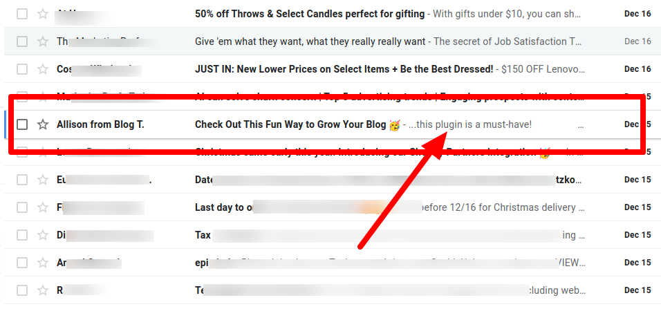
Notice how it perfectly complements the subject line. And the best part is it gives all the information (and reason) you’d need to open the email, but without revealing the actual secret!
15. Design
Ask: Have we optimized our email design?
Why it matters: To begin with, even if you’re sending only text, you would need to format it right for better reading. Next, there will be an outgoing link that you want to place in a way people like to (and find it convenient to) click. Then there’s the image, your logo, sometimes a table of data, the occasional GIF file and all that.
All this calls for the eyes of a good designer who will help the email perform better by making improvements (sometimes very basic changes) in the email. And after all that, you want to understand the colors, links, text and all that renders correctly on different types of email clients.
And design isn’t important just for aesthetics. Design is important to make sure your visitors get a consistent experience, whether they’re reading your emails or browsing through your website.
Look at the following:

On your left is the email design, while on your right is the website design.
See how the logo placement, fonts, colors, layout and other things are used identically?
Such design provides trust and prevents dissonance, in addition to making reading your emails a pleasant experience.
16. Format
Ask: Is the layout easy on the eye? Are the paragraphs short?
Why it matters: How you format your email depends upon a number of things. We took screenshots of two emails and placed them next to each other.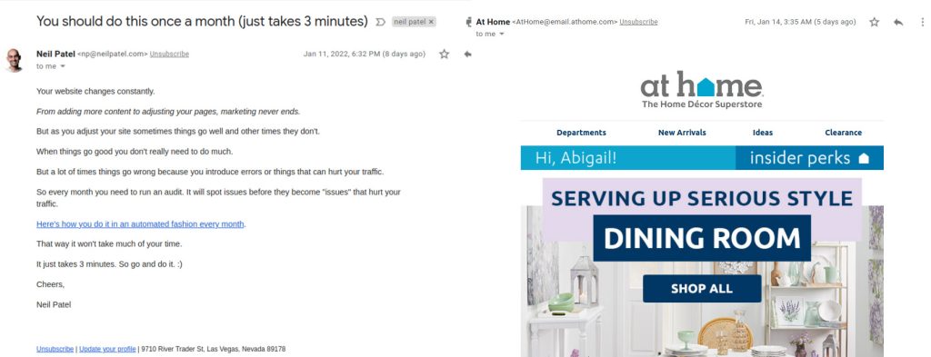
The email on your left is from Neil Patel. It is as plain-looking as can be – no images, no fancy fonts, no eye-catching CTA buttons – and there’s only one link. Short, direct, to-the-point.
The email on your right is from At Home. We have curtailed it, but the entire email is carefully designed and has lots of images.
So which format is better? The answer is: both. That’s because they’re both experts and they’ve designed the email to suit their industry and their audience.
The point here is: there’s no one way of designing or formating your email. But once you’ve figured out what works best for you, it’s important that you stick to it.
Email Pre-send checklist: Operational-level items
These points are quite important in themselves to make sure your email looks professional and neat. Fortunately, they don’t require any detailed explanation.
17. Grammar and language
Ask: Is our email copy free from language errors?
Why it matters: To ensure your message is understood exactly the way you wanted it to be.
18. Links
Ask: Are all the links working?
Why it matters: To ensure recipients land on the page you wanted them to. Incorrect links are frustrating and too many links make your email look spammy.
19. Analytics
Ask: Are the codes and UTM parameters set up to ensure tracking?
Why it matters: To make sure you can collect all data possible, in order to make improvements in the subsequent emails and also learn about your email marketing ROI.
20. Images
Ask: Have we added the ALT text to images? Are there any unnecessary images we can drop?
Why it matters: To help proper rendering and communication
21. Size
Ask: Is the email too bulky due to images?
Why it matters: To keep your email within reasonable size and, more importantly, to ensure that there’s no delay in loading when the recipient clicks on your email to open it.

